
The cooperative projects or co-op projects provide final year students of our BA programmes with opportunities to join collaborative projects sponsored by clients in both the commercial and non-profit sectors. Held over nine weeks between September and November, the Projects feature students from different disciplines addressing a mutually agreed design brief.
Followings are the cooperative projects participating in this year's Virtual Degree Show.
Contact us for collaboration opportunities or hiring interns. For those who are interested in hiring graduates, please watch their self-introductions to get to know about them.
Inspiring Change in Water Consumption Habits
| Programme | : | BA(Hons) Scheme in Design |
| Subject | : | Cooperative Project (9 weeks, Semester 1, Year 4) |
| Collaborator | : | Water for Free |
| Project Tutor | : | Stefan SONNTAG |
Advertising Design
CHEUNG King Ting
CHIU Yuen Sim
DE COSTER Lola Nicole M
FREITAS FERNANDES Luana Valeria
TANG Hoi Ling
YIU Yee Tung
YU On Lam
Communication Design
AGARWAL Anoushka
CHAN Yin Lam
MOK Ka Ki
YAN Jing Tian
Environment and Interior Design
CHAN Hiu Ching
CHOU Yu-hsuan
CHUNG Man Yu
Social Design
LEE Kin Wai Ken
LI Sin Yan
Design Brief
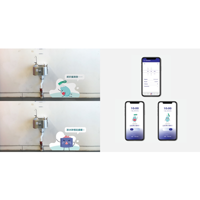
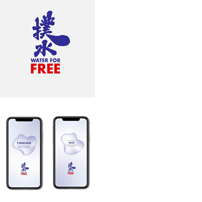
Founded in 2013, Water for Free is a non-profit Hong Kong based organisation that aims to reduce plastic waste and challenge existing approaches to recycling. In recent years, Water for Free has installed 70 water dispensers in schools to provide free water and stop people from buying single-use water bottles. The organisation has also developed an app to find the closest water dispenser among 1,500 locations in Hong Kong.
Although the Water for Free app covers over 1,500 water dispenser locations, the organisation realises that this is still insufficient to serve the more than 7 million people in Hong Kong. Thus, students were commissioned to develop design and campaign strategies to promote changes in consumption habits and start a movement towards developing a society that has less impact on landfills and marine life.
Design Outcome
Over nine weeks, the student team conducted research on the consumption behaviour and drinking habits of Hong Kong people and their understanding of the plastic waste problem in the region. The team identified a number of advertising opportunities and developed several design campaigns based on their insights.
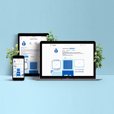
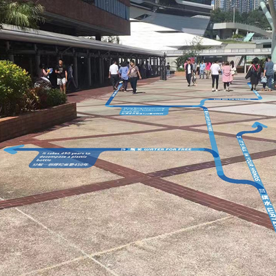
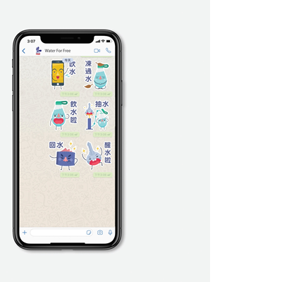
An important finding from the students’ research interviews was that people tend to forget to bring their refillable bottles, and hence make less use of the water dispensers. In light of this, the students devised an advertising strategy called ‘Essential 4’ to remind people to take essential items, such as their phone, wallet, keys and water bottle, when they leave home. The students designed four cartoon characters with unique personalities, appearances and storylines, which they then incorporated into animations, social media posts and app stickers. The advertising strategy aims to motivate the target users to cultivate a habit of carrying refillable water bottles in their daily lives, and hence to reduce the need to purchase bottled water.
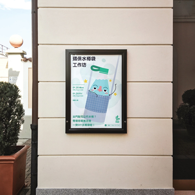
Other design and awareness campaigns include new signage designs for the water dispenser locations, updates to Water for Free’s mobile app, a bottle bag upcycling workshop, exhibitions on plastic waste and a logo rebrand for Water for Free.
The rebranded logo and several other design applications were licensed to Water for Free in 2020.
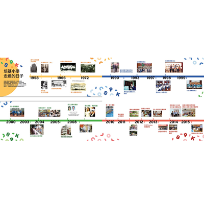
30th Anniversary Celebratory Designs for Stewards Pooi Kei Primary School
| Programme | : | BA(Hons) Scheme in Design |
| Subject | : | Cooperative Project (9 weeks, Semester 1, Year 4) |
| Collaborator | : | Stewards Pooi Kei Primary School |
| Project Tutor | : | Roberto VILCHIS ECHEVERRI |
Advertising Design
CHAN Kei Tung
KWOK Chi Yeung
MAK Yu Yung
NG Sze Long Rachel
Communication Design
HO Sin Yu
KIM Se Yoon
NG Mau Ying
YU Shuk Man
YU Wing Ching
Environment and Interior Design
CHAN Yat Hei
KOO Wing Ni
Social Design
CHAN Ching Kwan
CHEUNG Chun Yin
Design Brief
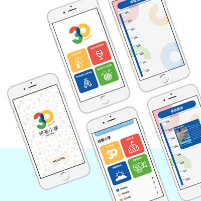
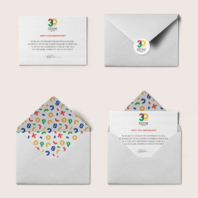
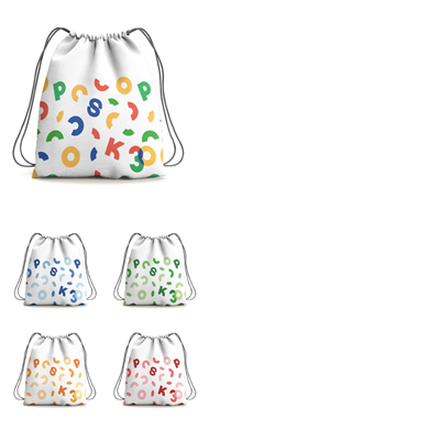
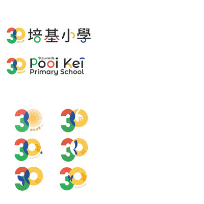
Stewards Pooi Kei Primary School plans to celebrate its 30th anniversary with an Open Day and other consecutive events during which visitors will experience the School’s campus facilities and partake in activities. The anniversary event will also aim to attract potential students, in addition to celebrating the School’s achievements with current students, parents, teachers, alumni and supporters. Students were tasked to identify designs for the anniversary event based on the School’s motto and theme of ‘Faith, Hope, Love and Honesty’.
Design Outcome
After conducting a detailed tour of the School and reflecting on the School’s teaching values, the student team identified ‘Happiness’ and ’Creativity’ as the keywords for this project. The students then designed a logo with playful and energetic elements and which used colours to represent the School’s four core values – faith, hope, love and honesty. The students then generated a pattern design from the logo that can be used in various applications, thus creating a unified theme.
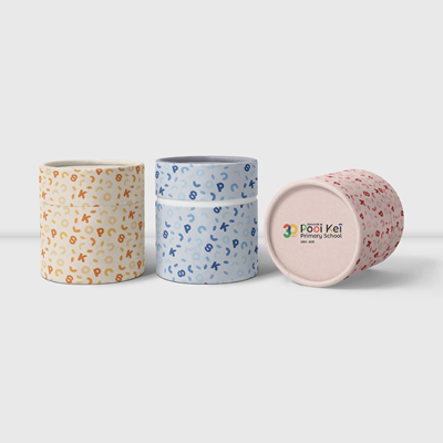
Various souvenirs were also designed to target different audiences, such as primary school students, teachers and guests. These designs include a drawstring bag, tote bag, tee shirt, tea set, invitation card and stationery.
Decorations were also designed for the Open Day events. The students proposed to decorate the classroom corridors and stage with the new pattern design, and the patterns were incorporated in a sponge stamp set so teachers and students will be able to participate in the actual decorating process. The students also proposed holding a workshop to let all guests and participants take part in decorating the School for this memorable event with the same patterned sponge stamp set and paints. Other decoration designs include a photo booth, an entrance balloon arch and an outstanding award wall.
The logo and pattern design, souvenirs and Open Day decoration design proposals were licensed to Stewards Pooi Kei Primary School for their 30th anniversary event in 2020.
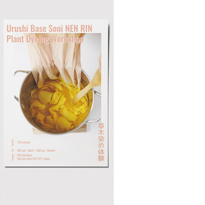
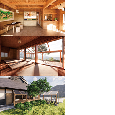
Sustainable Tourism for Soni-Mura
| Programme | : | BA(Hons) Scheme in Design |
| Subject | : | Cooperative Project (9 weeks, Semester 1, Year 4) |
| Collaborator | : | Roots Inc. |
| Project Tutor | : | Michael CHAN |
Advertising Design
CHOW Pui Yu
MOK Sze Kwan
Environment and Interior Design
CHOI Ka Man
LAM Ka Siu
LEUNG Cheuk Sum
SHIU Shuk Man
WONG Nap San Kelvin
YAO Xiaoqian
YEUNG Chi Hang
YEUNG Choi Kiu
YUEN Ying Ching
Product Design
LAI Hiu Cheung
MAK Ming Huen
Social Design
CHAN Wing Kei Eunice
YEUNG Wing Tung
Design Brief
Soni-Mura is a village located in Uda district, Nara prefecture, Japan. The village faces social issues relating to aging, depopulation, isolation, a lack of government support and declining local industries.
Roots Inc., an organisation that specialises in and promotes sustainable tourism, collaborated with students on this project with the aim of promoting the preservation of local culture, while creating a sustainable environment for Soni. The design tasks included redesigning the tourism centre, promoting the local village life and introducing Soni’s rich history, culture and traditional crafts to both international and local tourists.
Design Outcome
To gain a deeper understanding of the local culture, the student team first embarked on a research and study trip to Soni, where they visited the Soni highlands and some local workshops. This provided the students with an opportunity to visit various sites, conduct interviews with the local villagers and industry practitioners and carry out first-hand observations. After observing the social issues in Soni, the students proposed a ‘4CO’ direction, comprising connection, cohesion, communication and co-creation, to enhance public engagement and create a more cohesive community.
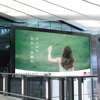
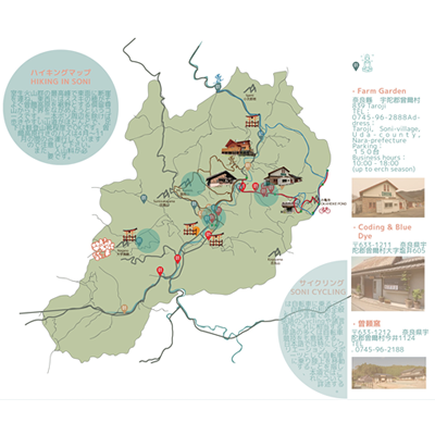
The students developed three holistic Soni travel packages for different travellers and visitors. The travel package campaigns included logo designs, advertising strategies in Japanese and English, a user interface for mobile applications, different workshops and farming experiences, camping adventures, hiking and meditation routes, souvenir designs and detailed tour map designs. A working holiday programme was also introduced, with the aim of attracting international visitors to Soni and creating a more diverse culture by attracting young and energetic participants and creating potential job opportunities. The programme also aimed to boost the local economy and mitigate social issues such as depopulation and a lack of international tourists.
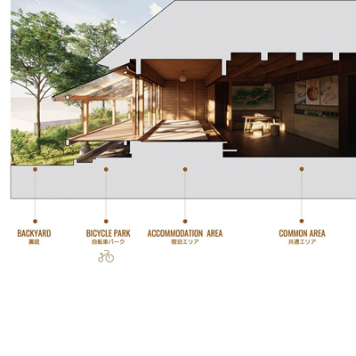
The students also designed local products and developed branding proposals based on the travel packages, which included a local character, an incense box, a camping and cycling lamp, and sake and bread packaging. Lastly, the students re-designed the Soni Information Centre, providing accommodation, office, dining and common areas, bicycle parking, and exhibition and workshop spaces.
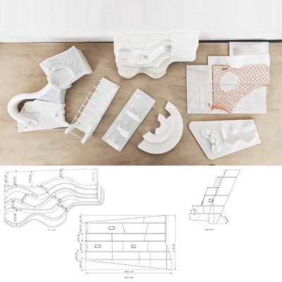
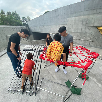
Designing an Intergenerational Play Space in Kowloon Park
| Programme | : | BA(Hons) Scheme in Design |
| Subject | : | Cooperative Project (9 weeks, Semester 1, Year 4) |
| Collaborator | : | Roots Inc. |
| Project Tutor | : | Michael CHAN |
Communication Design
CHAU Hei Ching
LAM Lam
Environment and Interior Design
LEE Chung Pan
LEE Yuen Yi
WU Mingyue
Product Design
CHAN Wai Ho
CHEN Qixuan
CHINN Iris Kathleen
HUI Hang Tat
TSANG Yuen Yee
Social Design
LUI Wing Yan
YIP Ying Kit Kitty
Design Brief
Outdoor space is more important than ever for mitigating double-ageing and play is an effective means of promoting ageing-in-place. Intergenerational Play Space is a user-centric design that enables users of all ages to play and interact with one another, increases the public’s utilisation and enjoyment of public space and encourages ‘creative play’.
The Jockey Club Design Institute for Social Innovation tasked students to propose creative but feasible ideas to improve the Kowloon Park Fitness Trail, with a focus on intergenerational play space solutions. The challenge was to understand the community’s needs and then design integrated equipment and a trail experience for users of different ages using multi-purpose, age-neutral designs that encourage creative play, intergenerational interaction and more efficient use of space.
Design Outcome
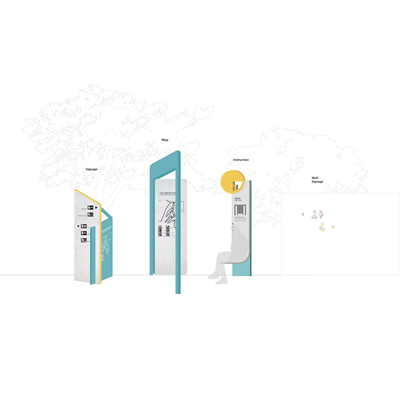
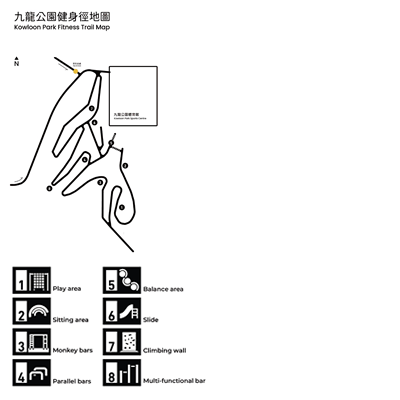
Based on first and second hand research, including site visits, spatial and equipment analyses, user observations and interviews, the students learned about playground safety regulations and identified some problems with the existing facilities in the Kowloon Park Fitness Trail. The students sought to redesign the wayfinding system and provide better maps along the trail, update the Fitness Trail with new facilities and equipment based on the users’ needs and develop new workout exercises and programmes suited to the new equipment.
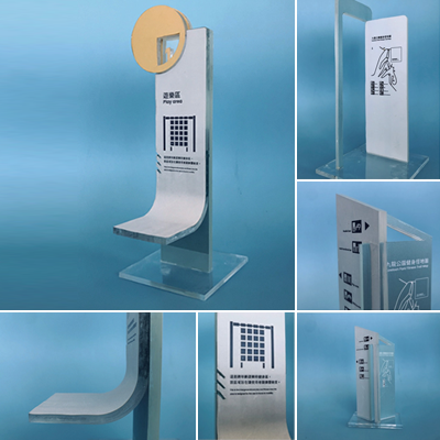
The students developed a new colour scheme and key visual elements in Memphis style, accented with bright colours and geometric shapes. The colours and patterns aimed to generate a distinctive, creative, modern and functional impression. A new wayfinding system and new facility/equipment instruction boards were also designed.
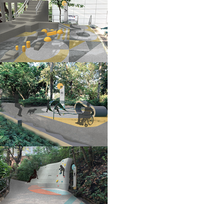
The fitness trail was redesigned into three areas – a play area, fitness area and leisure area. The play area aims to promote intergenerational and inclusive play on the fitness trail, with better access for wheelchair users. The students studied the existing interaction flow and user movements in relation to the existing equipment, and used tubes and nets to create play elements that resembled the existing play situation. Other facilities include a monkey bar, balancing beams, slide, climbing wall and multifunctional bars. The students created real-life scaled prototypes and mock-ups for some of the equipment and facility designs for user testing and material exploration.
Carer Empowerment
| Programme | : | BA(Hons) Scheme in Design |
| Subject | : | Cooperative Project (9 weeks, Semester 1, Year 4) |
| Collaborator | : | Acesobee Ltd. |
| Project Tutor | : | Christotrian TONG |
Advertising Design
LI Nga Ching
TAM Wing Man
WONG Chun Hei
WONG Yin Nok
Communication Design
AU Long Hin Byron
CHAN Man Yin
LAU Hau Wah
NG Yik Ka Scarlet
Social Design
CHENG Yan Chak
KUO Wai Lap
LAM Sze Ki
TAM Tsz Kin Jeff
Design Brief
It is widely acknowledged that many carers face difficulties while caring and supporting for family members and friends who have a disability, mental illness or chronic condition . To strengthen support for carers, further empower them and help reintegrate them into society, the Hong Kong Federation of Women’s Centres launched a three-year ‘ All Brilliant Carers’ project, with a mobile app developed by Acesobee Ltd. Taking this opportunity, Acesobee collaborated with students to further enhance the mobile app’s user interface and user experience, and develop a new promotion strategy for the carers project.
Design Outcome
The students first conducted interviews and questionnaires as primary research to further understand the daily life situation and mental status of carers. The students found that the carers lacked information about the available resources due to ineffective communication methods, and most of the participants were not familiar with smart phone usage . Hence, the students sought to design tangible communication channels and develop visual promotion campaigns.
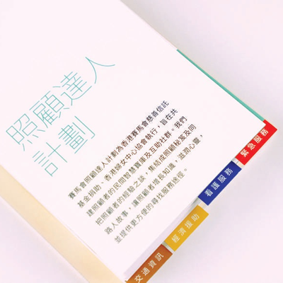
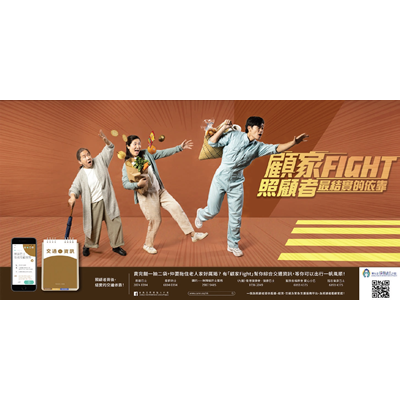
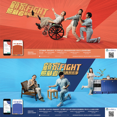
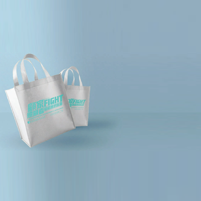
A visual guideline was developed to maintain a consistent style for the designs and products, and for later developments. The students came up with the ‘ 顧家 FIGHT’ logotype and tagline, which was chosen as a pun from a well-known musician in the 1970s and ’80s that would likely resonate with the target users. The tagline also represented the hardworking spirit, positive attitude and responsibilities of carers in caring for family members in need.
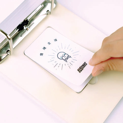
Advertising campaigns were developed with a relaxing and humorous tone , with the aim of creating a positive and energetic image of carers and raising the public’s awareness on their situation . The students also designed a ‘ Carer’s Info Card Set’ providing extensive information on the services and resources offered by different supporting organisations and medical service centres that carers may need. The students classified the database into four main categories, namely ‘ Emergency Services’ , ‘ Nursing Services ’, ’Financial Assistance’ and ‘ Traffic Information ’. The design of the Info Card Set was inspired by the Yellow Pages and traditional calendars, with a minimal yet eye-catching visual design.
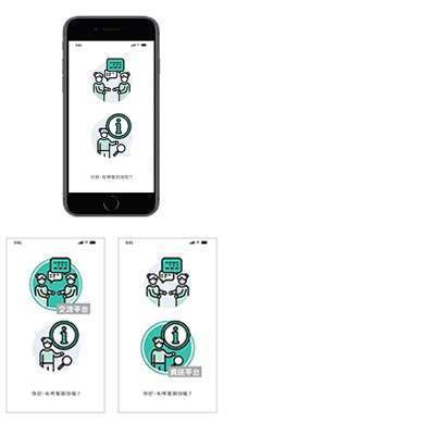
The students also re designed the ‘ All Brilliant Carers’ mobile app, with improved app functions, a new communication platform and a digitalised version of the ‘ Carers’ Info Card Set’.
Store of Happiness 幸福雜貨舖
| Programme | : | BA(Hons) in Digital Media |
| Subject | : | Co-operative Project (10 weeks, Semester 1, Year 2) |
| Collaborator | : | Christian Family Service Centre, Centre for Adolescent Mental Health Prevention and Intervention |
| Project Tutor | : | Step CHEUNG, Jae OH |
Digital Media
CHOW Cheuk Neng
LAM Wee Yi
LAW Chui Yan
WU Tsz Lam
Project Description
The Centre for Adolescent Mental Health Prevention and Intervention was set up in 2011 to provide one-stop services for adolescents with mental health concerns. This group of Digital Media students worked on an animation, with the grocery store owner in Meng Po image, who uses simple Chinese ingredients (柴米油鹽醬醋茶) to make “To-forget” dumplings set (忘憂餃子套餐) for people who visit. The “To-forget” dumplings set represents mental food, and would take away people’s worries and clouded thoughts. The grocery store named “Store of Happiness” (幸福雜貨舖) also aims to introduce the Centre’s mobile counselling services.
Repel the Internet Demon擊退心魔,永冇甩拖
| Programme | : | BA(Hons) in Digital Media |
| Subject | : | Co-operative Project (10 weeks, Semester 1, Year 2) |
| Collaborator | : | Christian Family Service Centre, Centre for Adolescent Mental Health Prevention and Intervention |
| Project Tutor | : | Step CHEUNG, Jae OH |
Digital Media
CHUI Kai Lun
HO Suen Wing
LAU On In
SAM Long Hei Roy
YUEN Ching Kit Jack
Project Description
The Centre for Adolescent Mental Health Prevention and Intervention’s rationale is “smart youth” and “smiling life”. This project objective was to let young people understand the problems caused by Internet addiction and remind them to avoid excessive use of the Internet. In this video, the student team created a naughty devil to show how it affects teenagers’ daily lives, and tackled the issue in a humourous way. The video is divided into four sections and each has their own themes, including Family, Personal Relationships, Health and Academic Achievements.
The Super Flying Dog
| Programme | : | BA(Hons) in Digital Media |
| Subject | : | Co-operative Project (10 weeks, Semester 1, Year 2) |
| Collaborator | : | One Cool BB Dubbing Production House Ltd |
| Project Tutor | : | Step CHEUNG, Jae OH |
Digital Media
CHAN Hung Man
CHOI Chok Ming
LI Yan
TANG Tsz Ying
TO Long Ying
Project Description
One Cool BB Dubbing Production House (OCBB) was established in 2019 and is a group of sound dubbing experts in voice overs and voice acting. OCBB collaborated with Digital Media students on this project to teach young children about dogs’ emotions, and educate them to treat dogs with kindness. The target audience is young children between 3-12 years old. Students created two short animations, and designed a team of “Super Flying Dogs” that would come to the rescue whenever other dogs are in danger.
“Born to Be a Storyteller” - Marketing Strategy for M Patisserie Cake Boutique
| Programme | : | BA(Hons) in Interactive Media |
| Subject | : | Co-operative Project (10 weeks, Semester 1, Year 2) |
| Collaborator | : | M Patisserie Limited |
| Project Tutor | : | Dominic LEUNG, Newman LAU |
Interactive Media
SIT Sze Man
WONG Shu Ting
YU Hei Nok
Design Brief
M Patisserie is a Hong Kong-based bakery shop. The name - M, stands for memorable. With a vision statement of “Art & Cake”, M Patisserie believes that each cake has its own meaning and story to tell, and hopes to share their clients’ special and memorable moments.
M Patisserie currently has an ineffective ordering operation system – with lengthy customer messages and manual purchasing database entries; and unsustainable customer relationships. The project aim was to tackle these existing problems, enhance customer experience, and introduce new features for the bakery.
Design Outcome
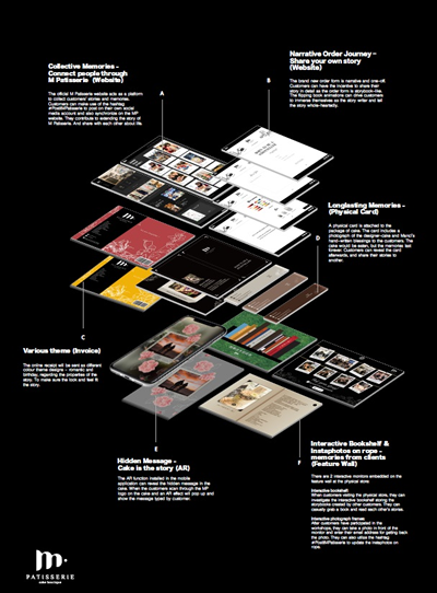
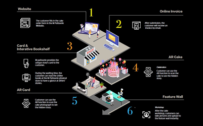
Students proposed a marketing strategy package that consists of reformation of the website, new built-in mobile app, and a feature wall in the physical store. The design strategy started with a vision statement of “Born to Be a Storyteller”, aiming to encourage interaction and enhance customers’ personal experience when ordering M Patisserie’s tailor-made designer cakes.
The new official website acts as a platform to collect customers’ stories and connect people under M Patisserie’s beliefs. Students also redesigned the cake ordering form in narrative interface with flipping-book animations. A physical card is also attached to the cake, which includes a photograph of the cake and handwritten notes, so customers can cherish the memory and story behind the occasion.
The feature wall in the physical store includes an interactive bookshelf and instant photo library, presented by two interactive monitors. Customers can read and share stories during their visit to the store and leave their memories after they participated in baking workshops.
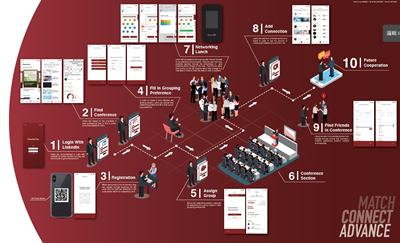
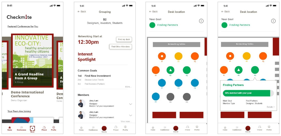
Checkmate - Networking in Conference
| Programme | : | BA(Hons) in Interactive Media |
| Subject | : | Co-operative Project (10 weeks, Semester 1, Year 2) |
| Collaborator | : | Milton Exhibits Group Limited |
| Project Tutor | : | Dominic LEUNG, Newman LAU |
Interactive Media
CHAN Ka Ying
CHAN Zoe
TAI Yat Wing
Design Brief
Networking is a chance for conference attendees and participants to meet important people, find peers and partners, and exchange information during conferences. Milton Exhibits tasked students to enhance conferencing features on a new mobile app, and propose new ideas for networking opportunities in conferences.
Design Outcome
After researching on needs analysis and networking traits, students found out that most participants are looking for new opportunities and are aiming to advance professionally when they join a conference. Students transformed these findings into design qualities for the new mobile app with “Match, “Connect” and “Advance” as the keywords, and aimed to enhance the social experience for conference participants.
Checkmate is a mobile app that provides networking opportunities and valuable conversations for conference participants. It allows conference attendees and participants to find potential conferences based on popularity in their professional fields, find potential networks with mutual interests and match individuals during conferences. It also acts as a networking session assistant, with features on navigating participants to similar groups, and providing reminders and guides.

